Stoked

concept | flexible identity | User interface & user experience

header stoked screen

project introduction

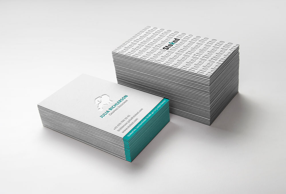
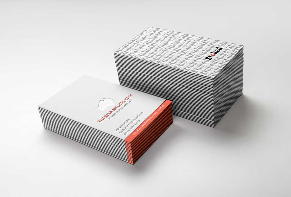
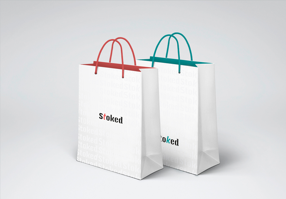
Stoked is an international snowboard, surfer & skater brand. Their aim is to create individual and personalised products for every costumer. A flexible identity was created for them to match the philosophy of their company.

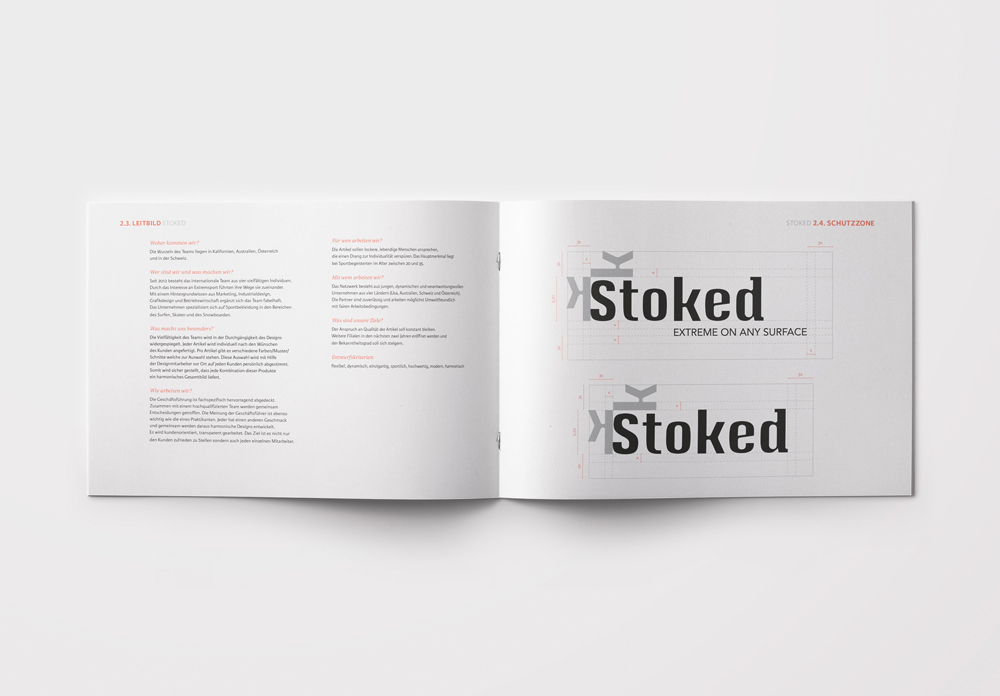
The flexible logo adapts according to the followingthree parameters. This results in a variety of 756 different and unique logo designs.

6 continents | 7 days | 18 temperature range | 756 logo options

step one - continent

Every letter of the logo is assigned to a continent in alphabetical order. Depending on which continent the store is located on, the letter that is assigned to that continent is the one that will be changing. When visiting their website the same changes occure, but instead of the store location, the users hometown is the trigger. Example below: Europe

jois logo
stoked logo

step two - weekday

Seven individual fonts are declared to the weekdays. Each weekday receives one particular font. The weekday indicates which font will be used for that particular letter.Example below: Europe on a Thursday

stoked logo
stoked logo

step three - temperature

The colour scheme adjusts the letter according to the outsite temperature. The temperature is measured in celsius and includes 18 different ranges. Example below: Europe on a Thursday at 9°C

stoked logo
stoked logo
stoked logo
stoked business cards

user interface

According to the users location temperature the website changes it’s interface colour. Furthermore the website offers the customer a tool to personalize their new board, their clothing and also shows a map of all the stores. around the world.

stoked desktop screen
stoked mobile screen webdesign